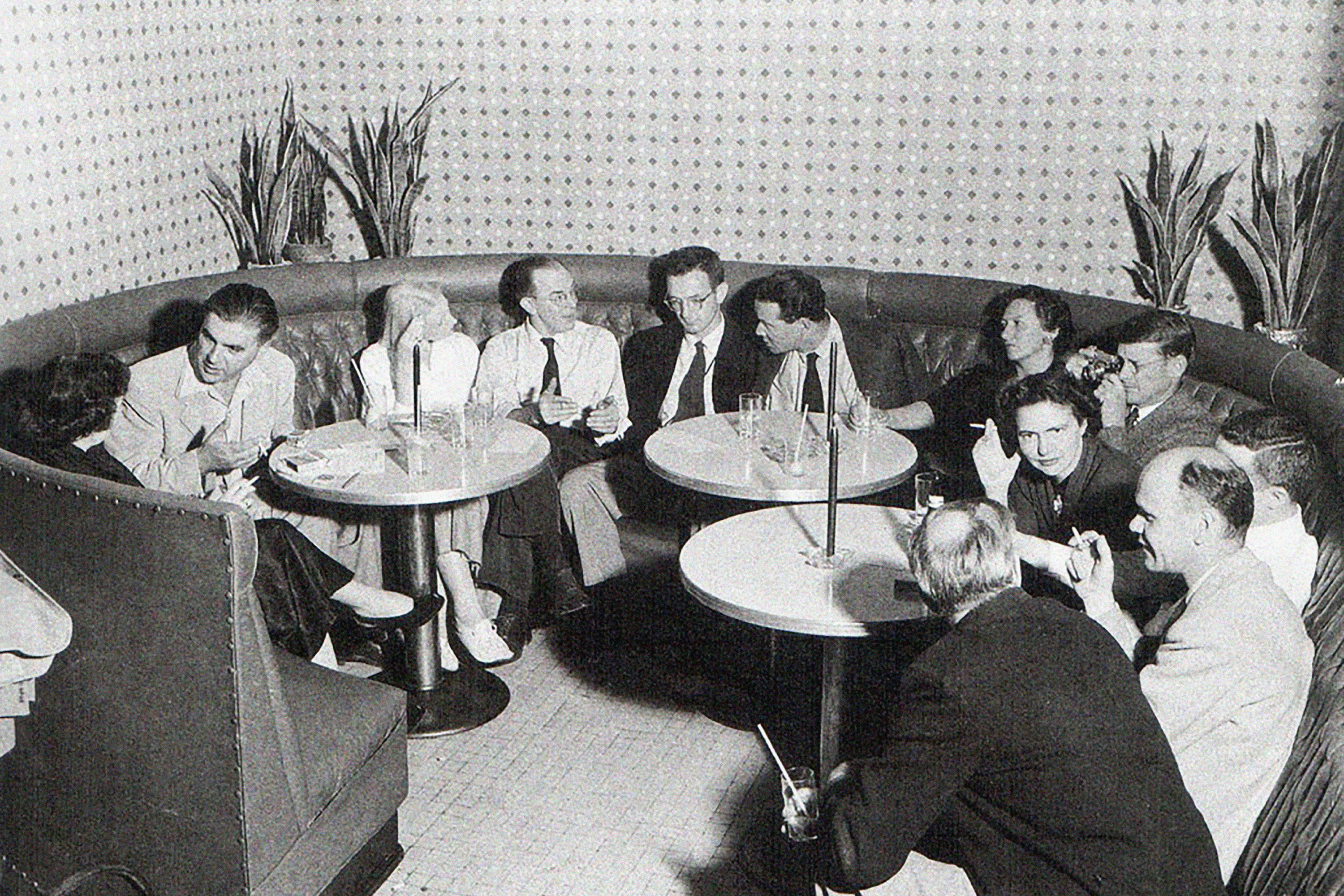
Aperture Foundation
Role: Designer
Year: 2018–2021
Role: Designer
Year: 2018–2021
Aperture Foundation is a nonprofit arts institution that began publishing a magazine in 1952. Since then, it has expanded into a multi-platform publisher and a major center for the photo community. They produce, publish, and present a program of photography projects, locally and internationally.
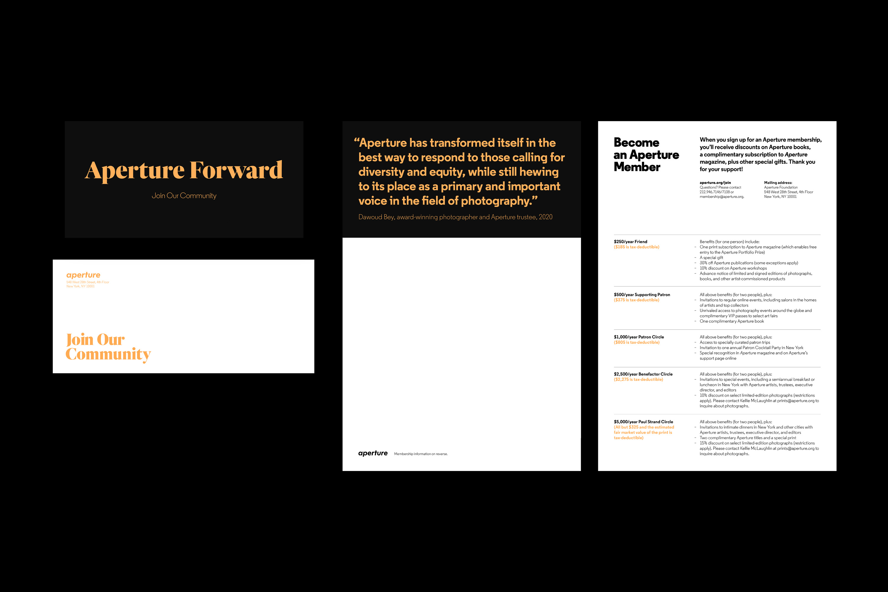
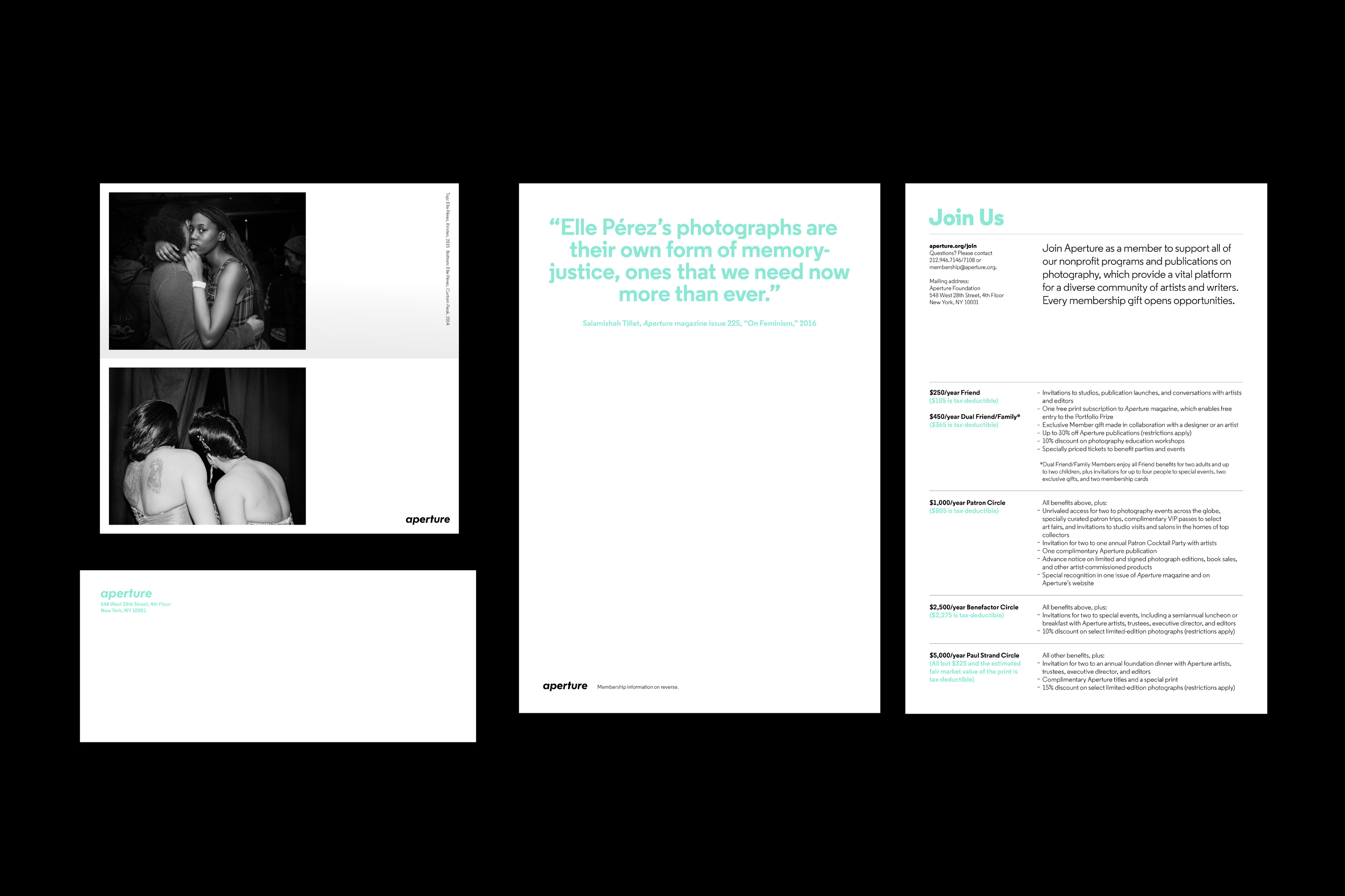
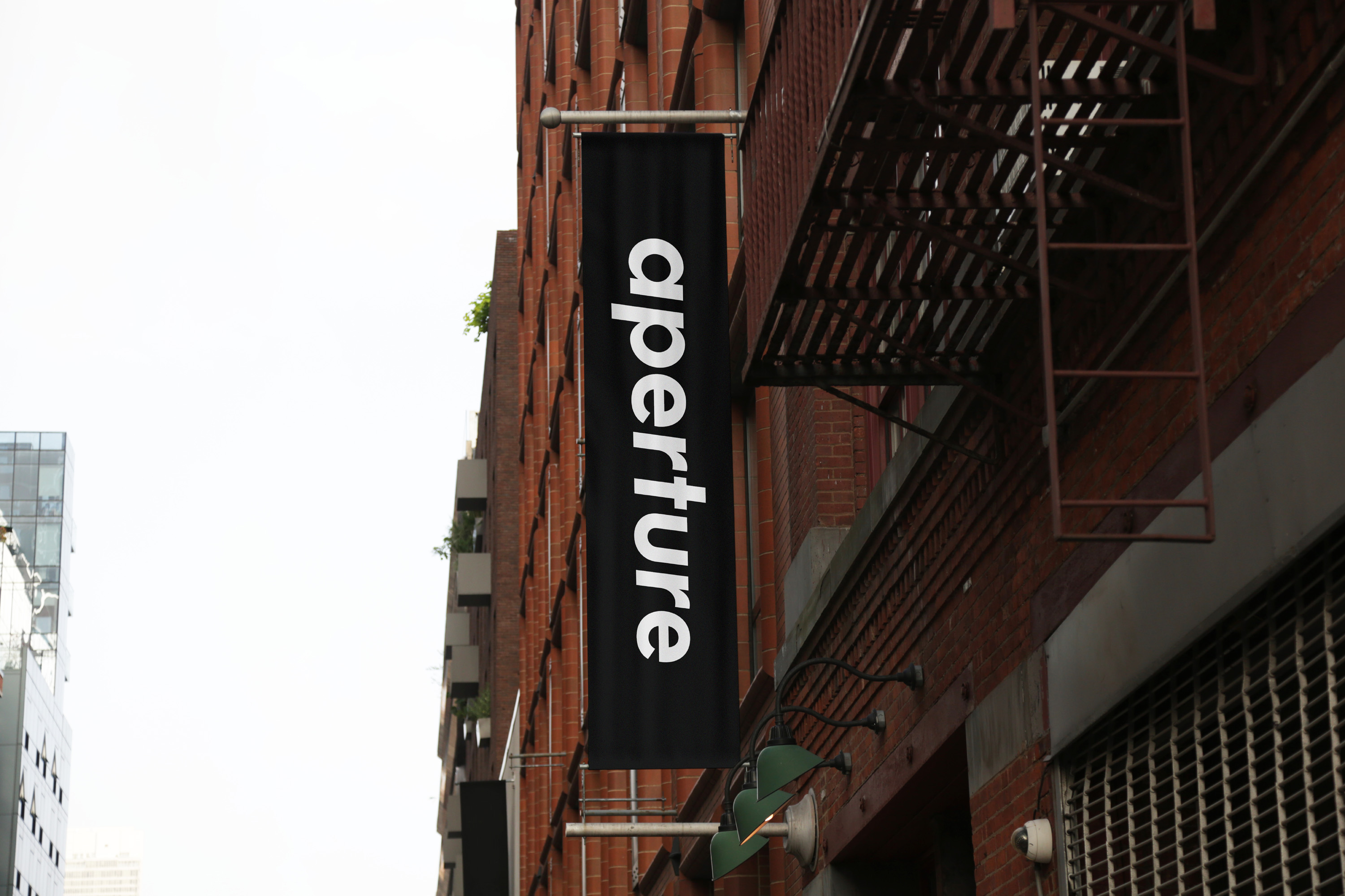
Over the years, Aperture’s visual identity has made a few shifts, and with the relaunch of the website in 2020 there was a conscious effort across the organization to make the overall branding more cohesive. With a greater focus on editorial content being produced for the site—and to honor its publishing history—the identity shifted to align more closely with the magazine. This redesign touched every area of the organization and resulted in a revamp of the entire brand identity and guidelines.


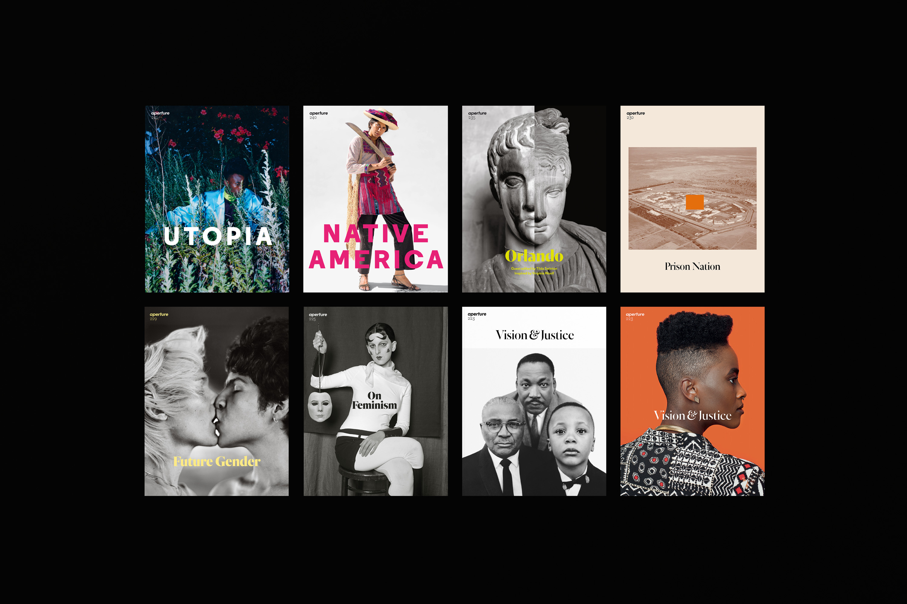
In 2011, the foundation and publishing program were given a rebrand. Their updated logo was a modernized version of the one found on the original issue of Aperture.
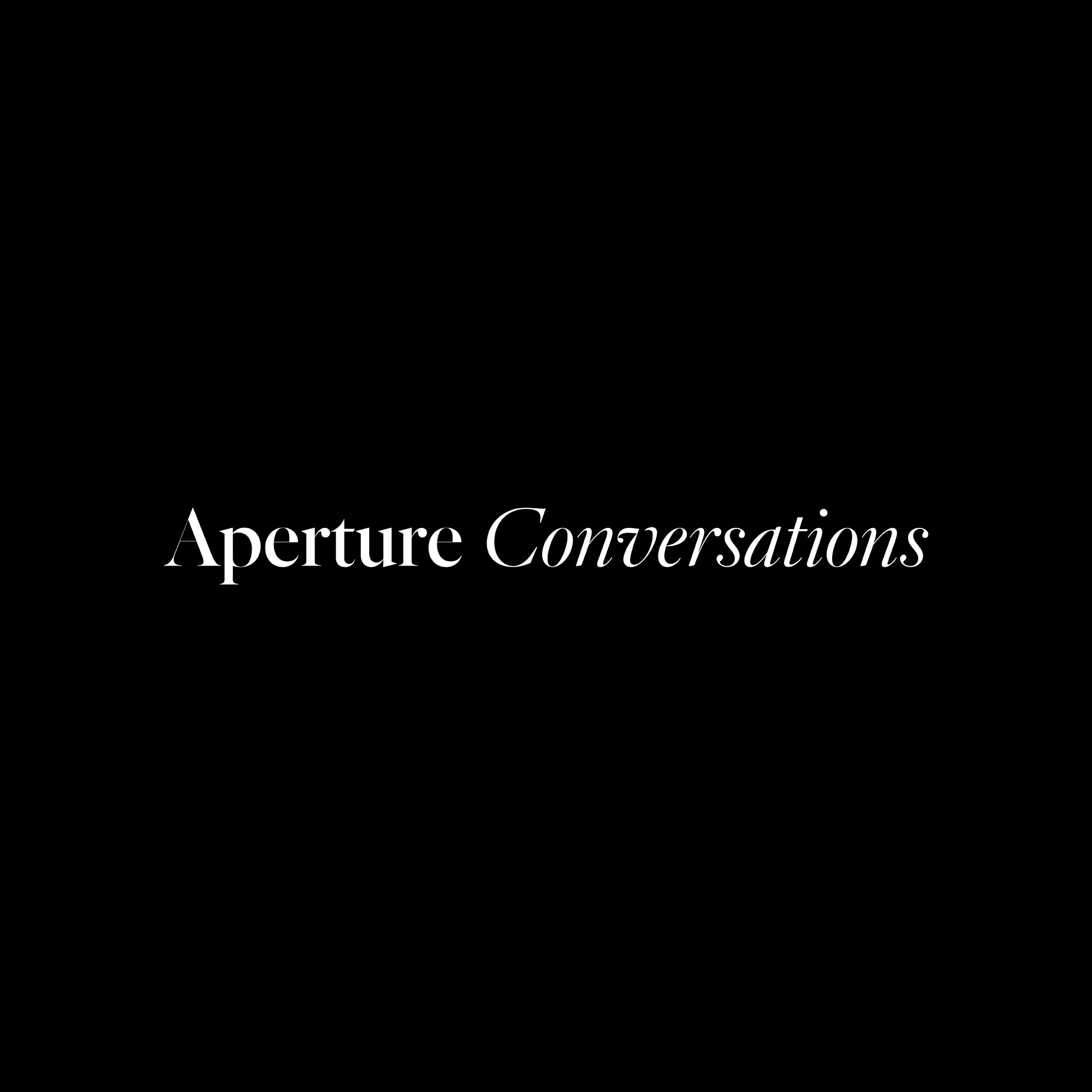
In 2013, the magazine was redesigned by London-based A2/SW/HK, who designed both the layout and custom typography within the magazine.
As a result, the magazine, publishing program, and foundation all shared the same logo but had different brand styles and typography.
In 2013, the magazine was redesigned by London-based A2/SW/HK, who designed both the layout and custom typography within the magazine.
As a result, the magazine, publishing program, and foundation all shared the same logo but had different brand styles and typography.
The goal for the redesign was to align these three areas more closely, which primarily focused on the use of the custom type found within the magazine and emphasis of black-and-white within layouts.
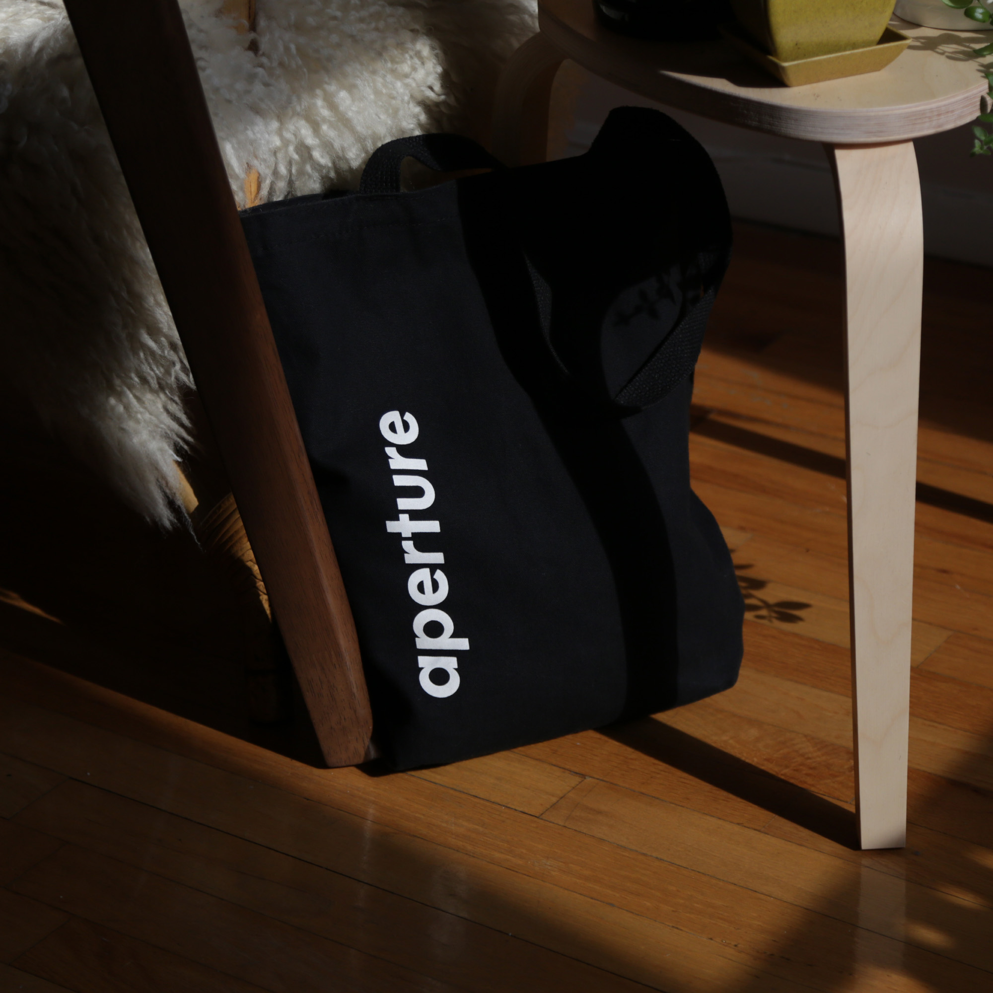
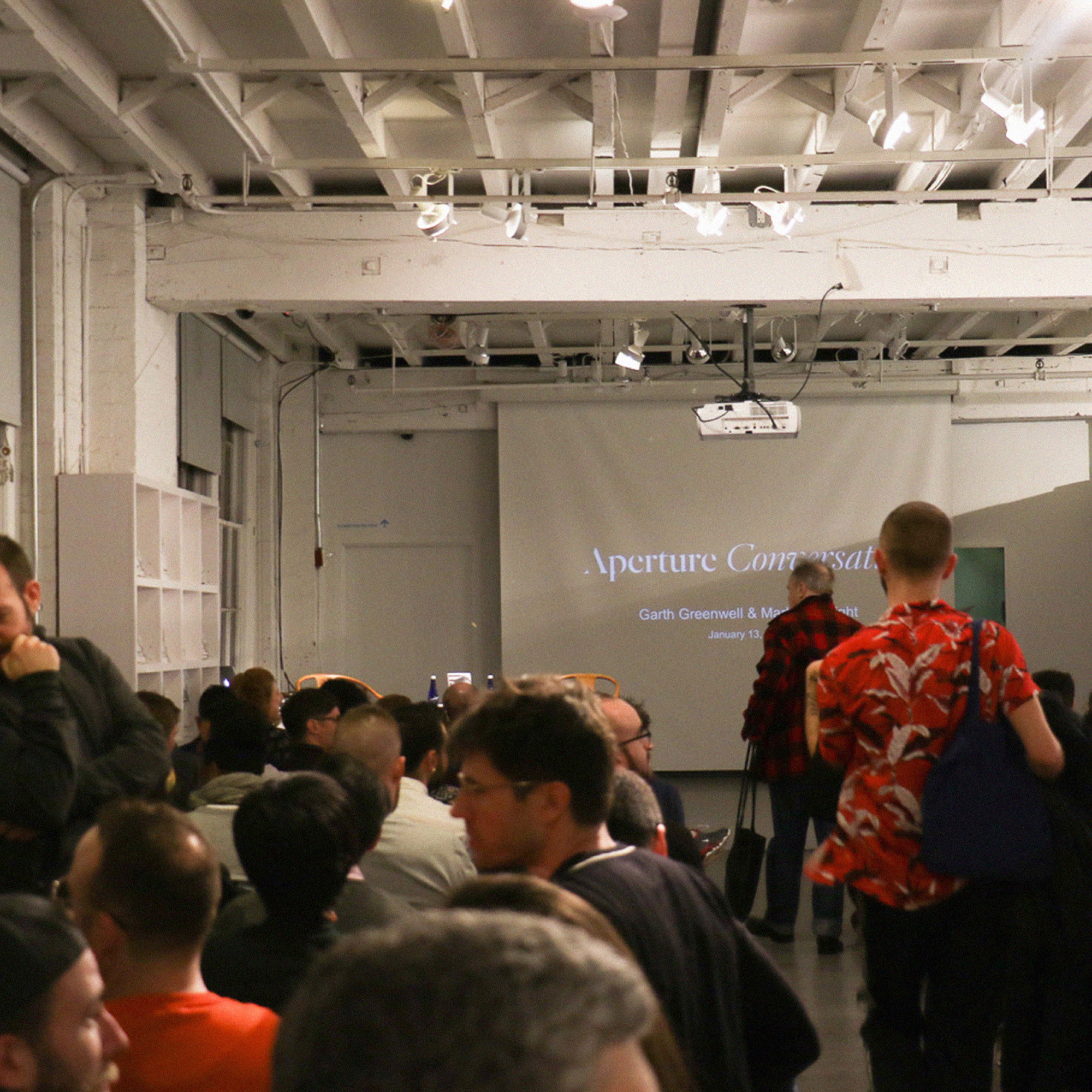
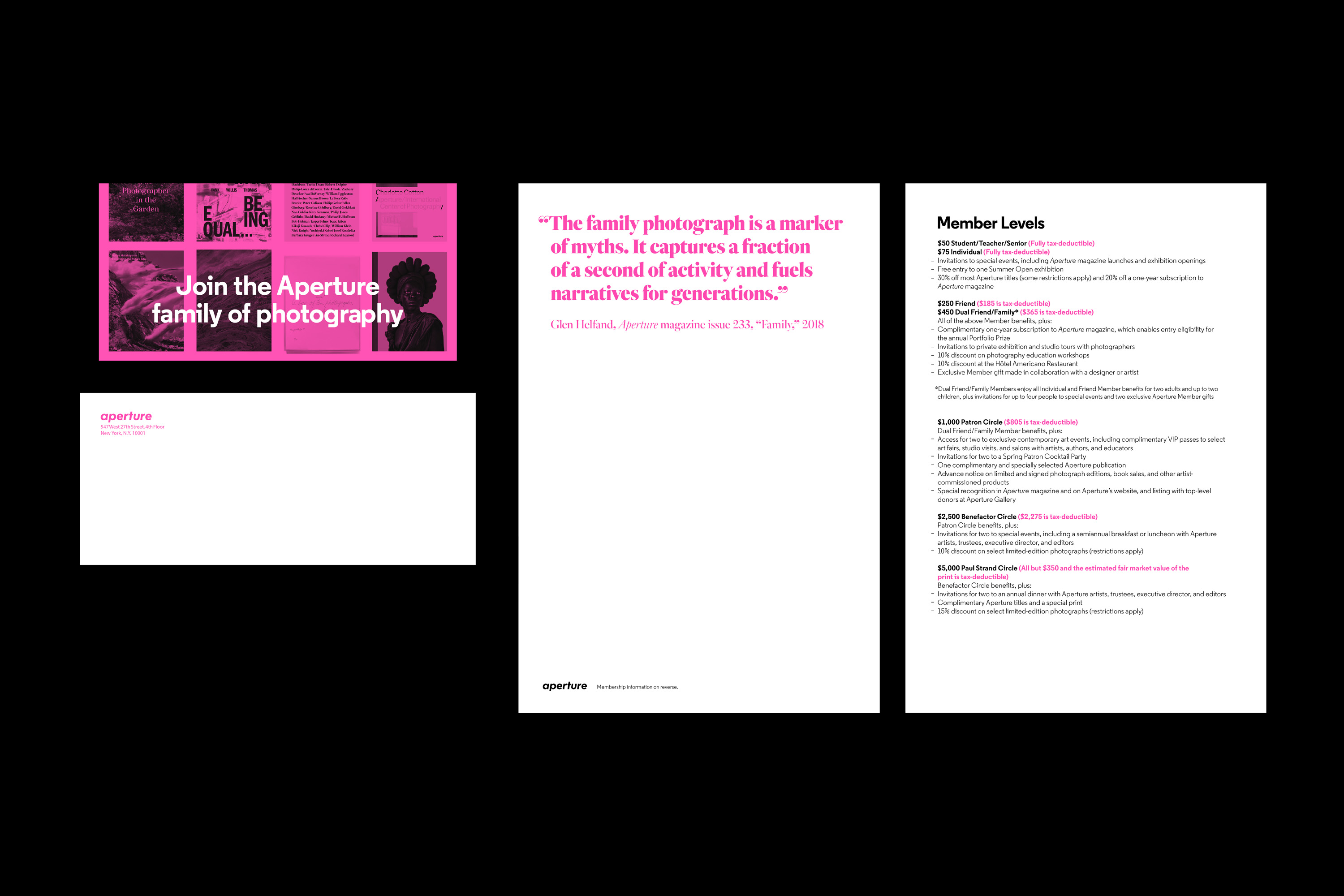
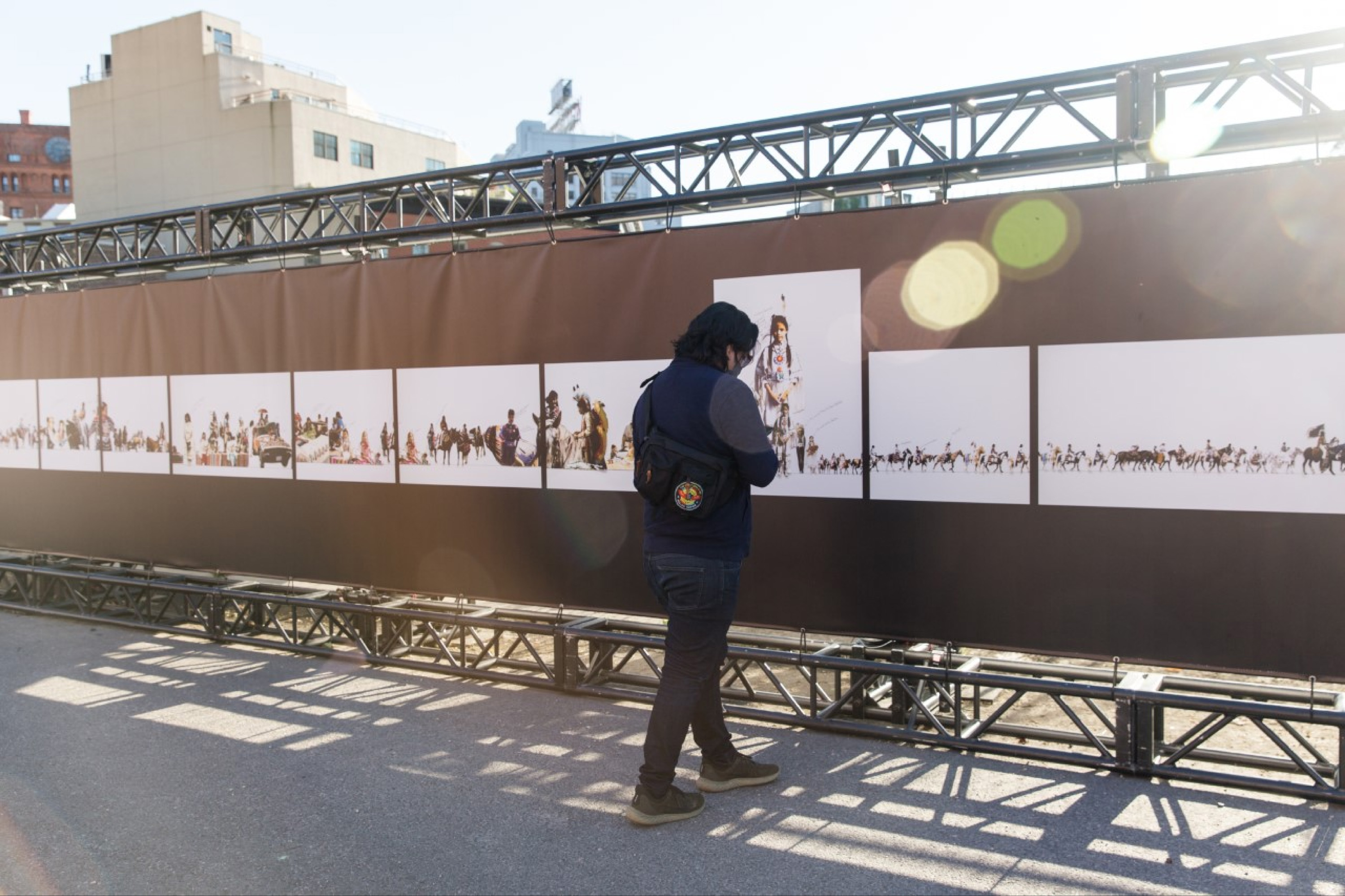
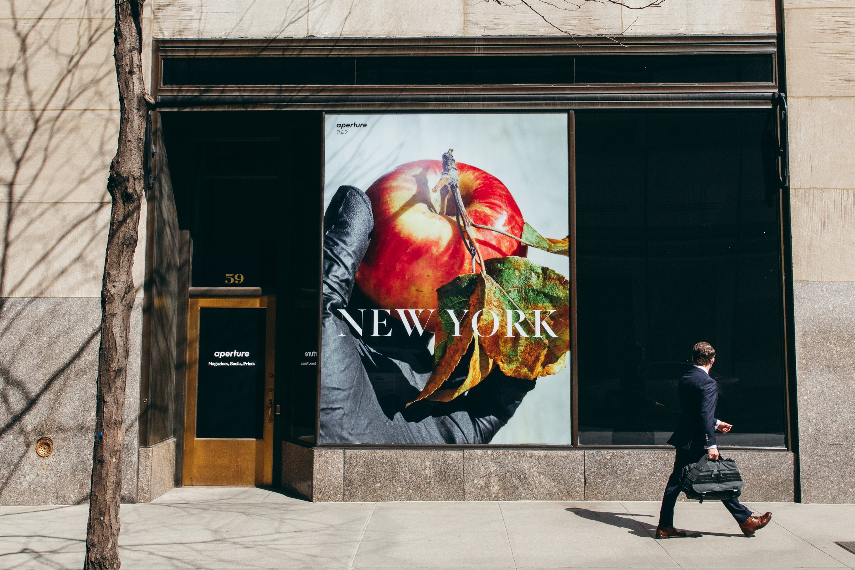
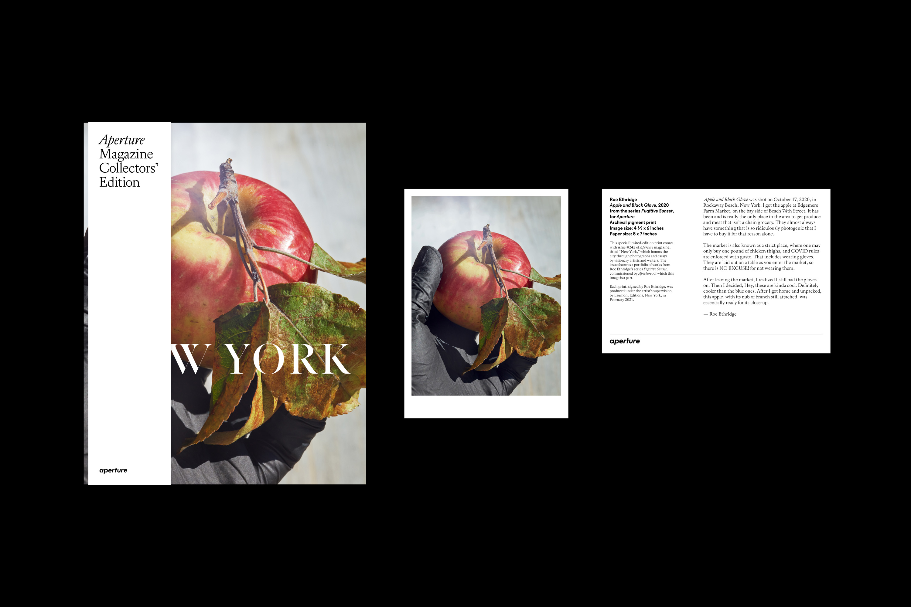
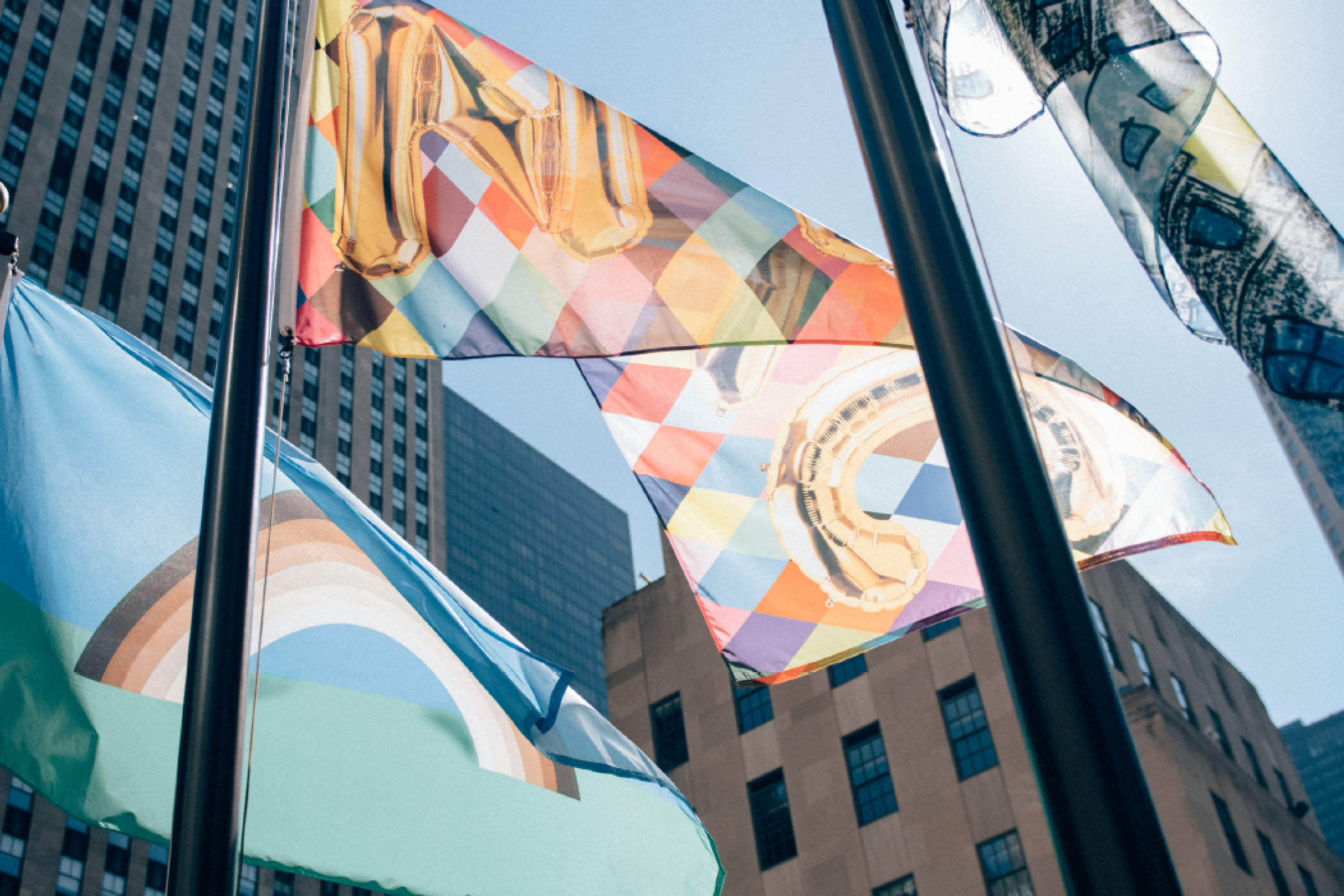
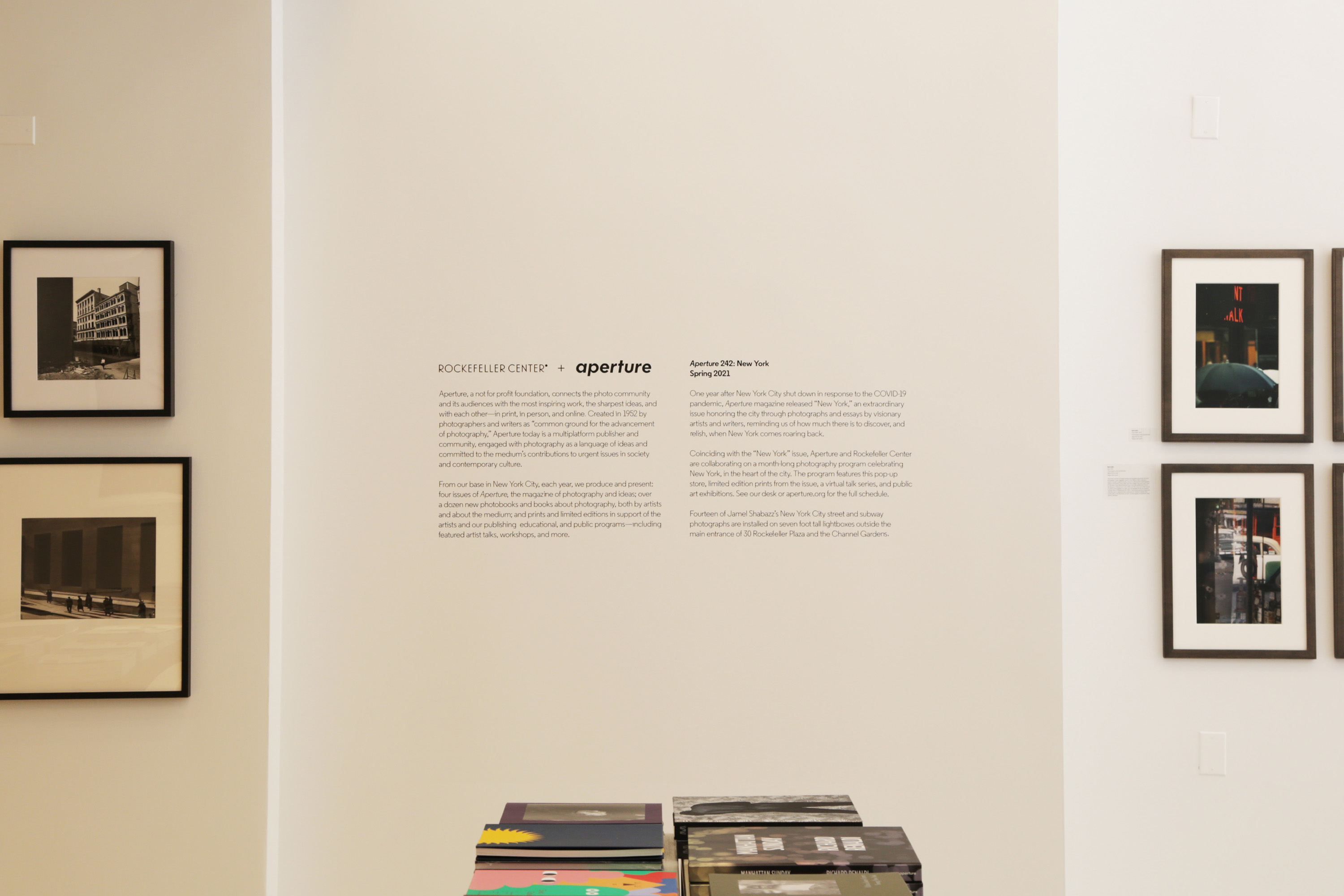
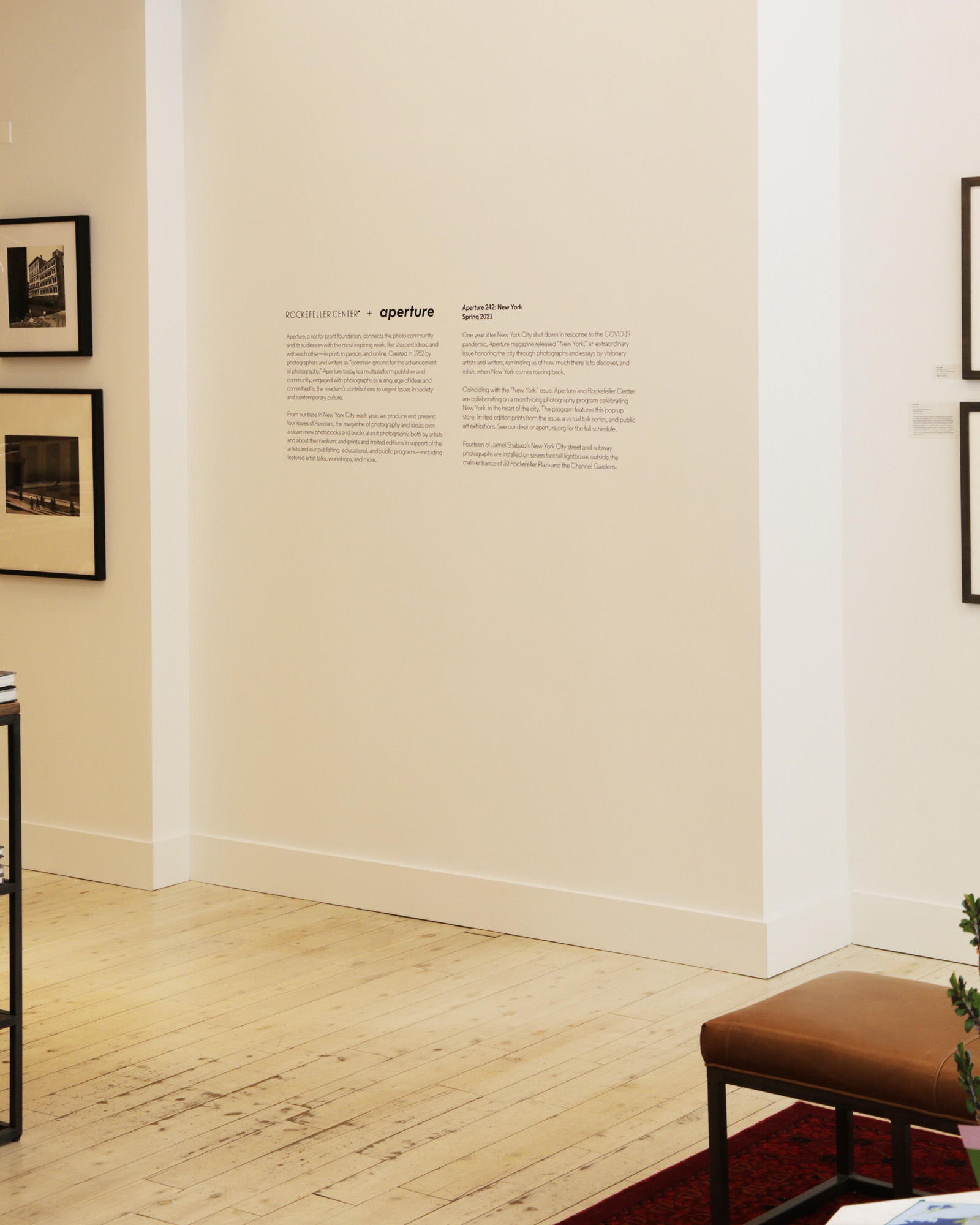
This brand shift occured through a roll-out method in preparation for the website revamp, and affected materials ranging from brand guidelines, general merchandise, development initiatives, artists talks, exhibitions, and pop-ups.
This brand shift occured through a roll-out method in preparation for the website revamp, and affected materials ranging from brand guidelines, general merchandise, development initiatives, artists talks, exhibitions, and pop-ups.