Nectar
Role: Senior Designer, Lead
Studio/Agency: Character
Year: 2022
Creative Director: Tish Evangelista
Design Director: Elaan Ventura Bourn
Senior Designer: Brandi Steele
Senior Copywriter: Andrew Mitchell
Associate Strategy Director: Channing Jones
Director of Partnerships: Teri Kaplan
Senior Project Manager: Courtney Liddell
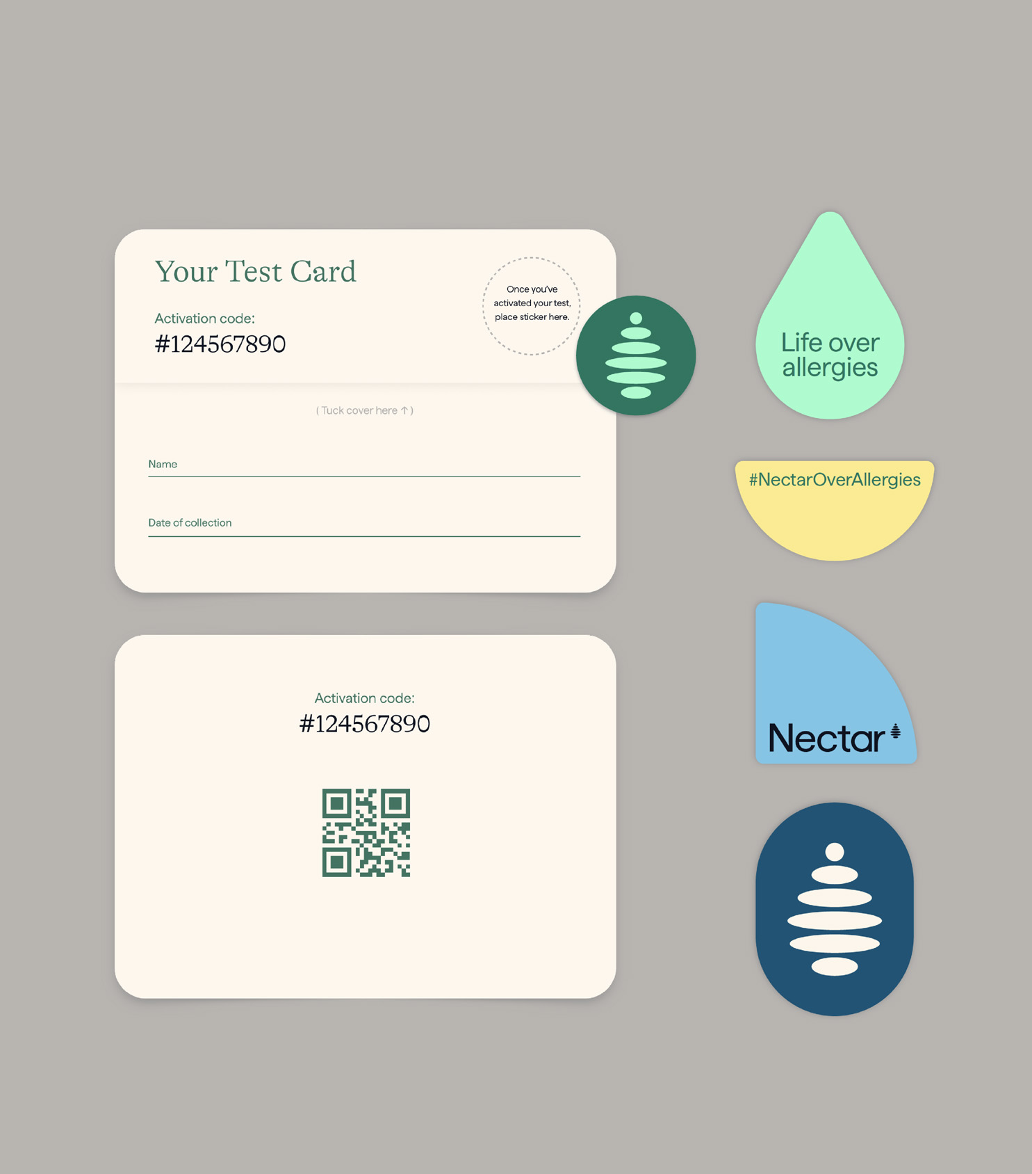
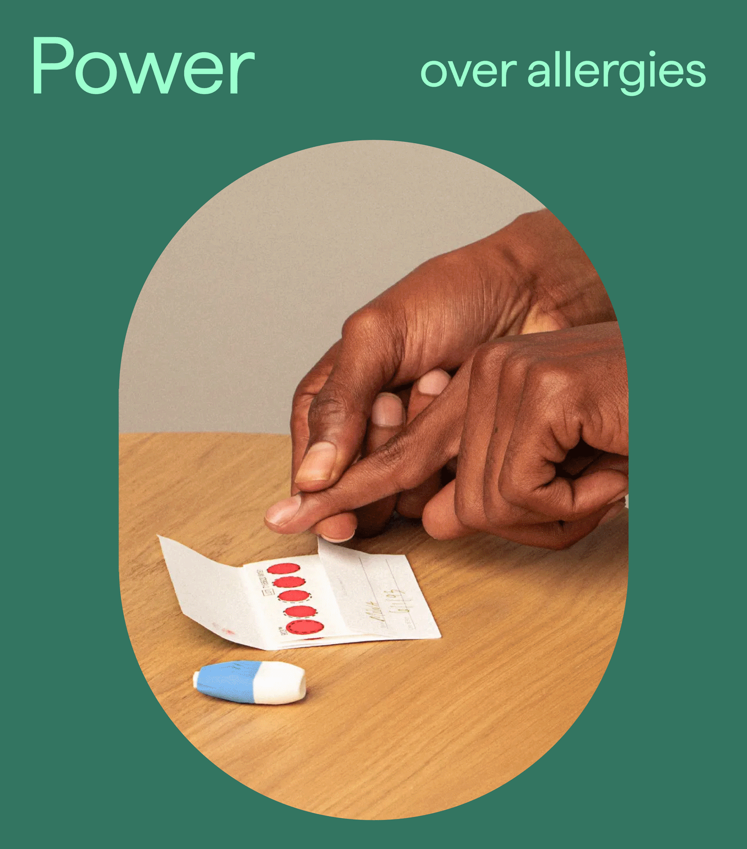
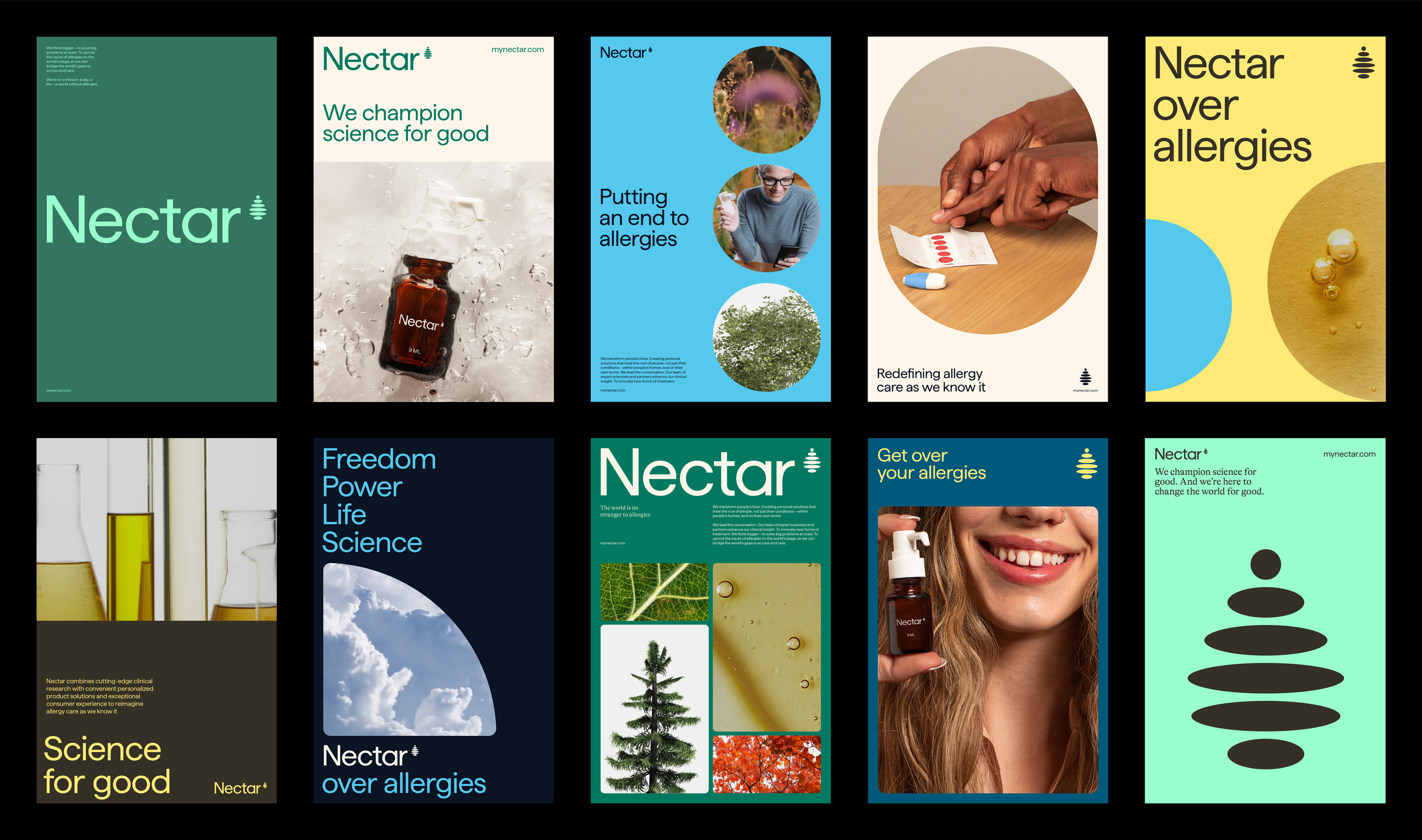
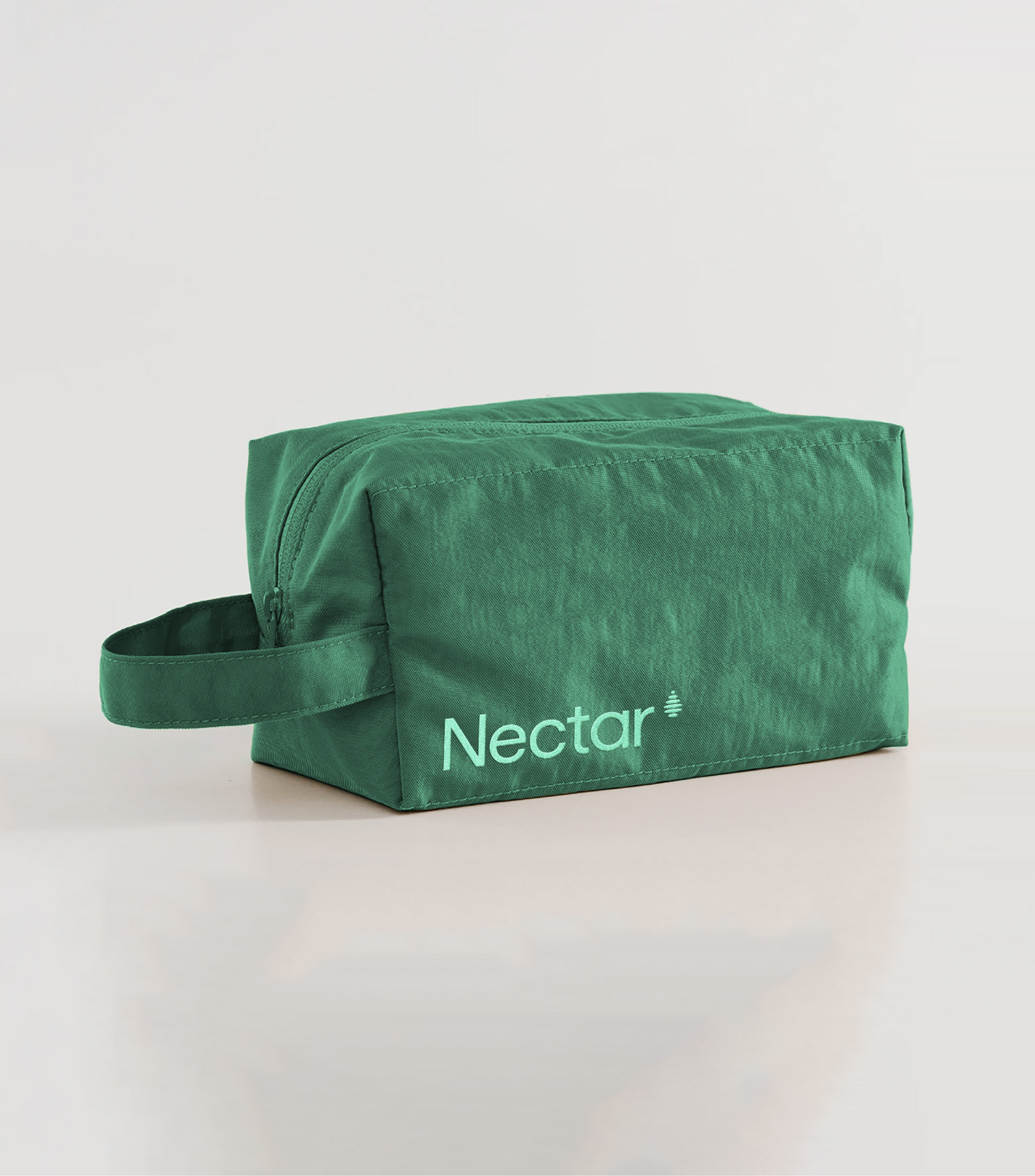
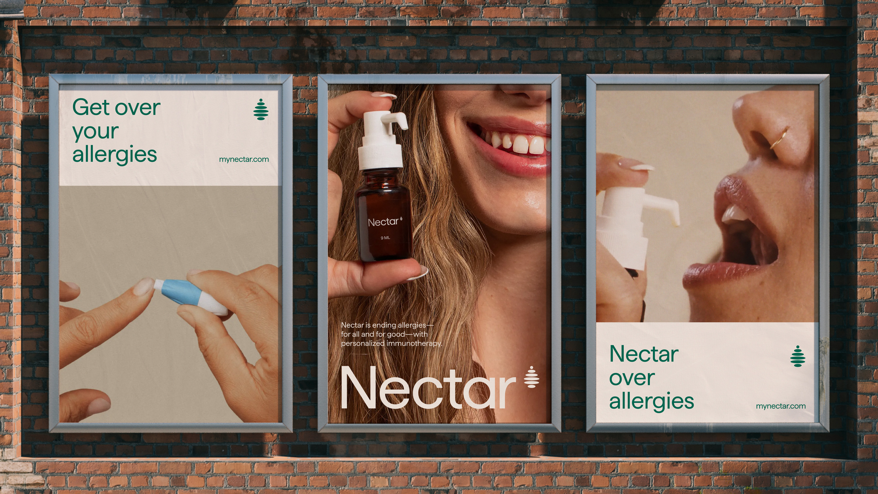
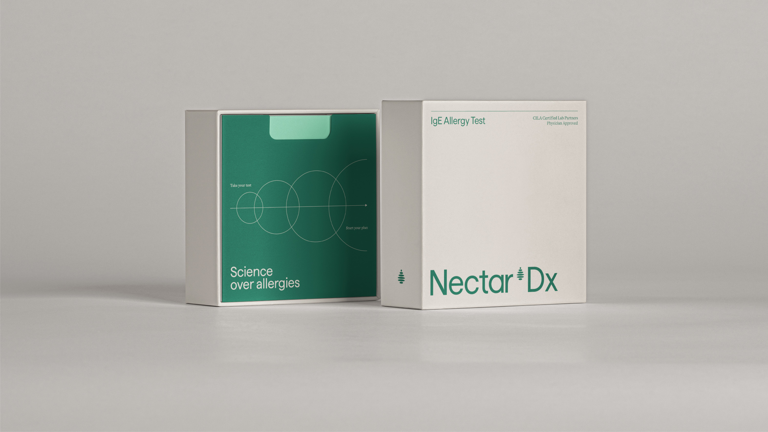
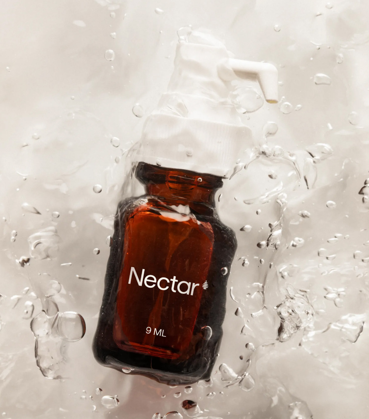
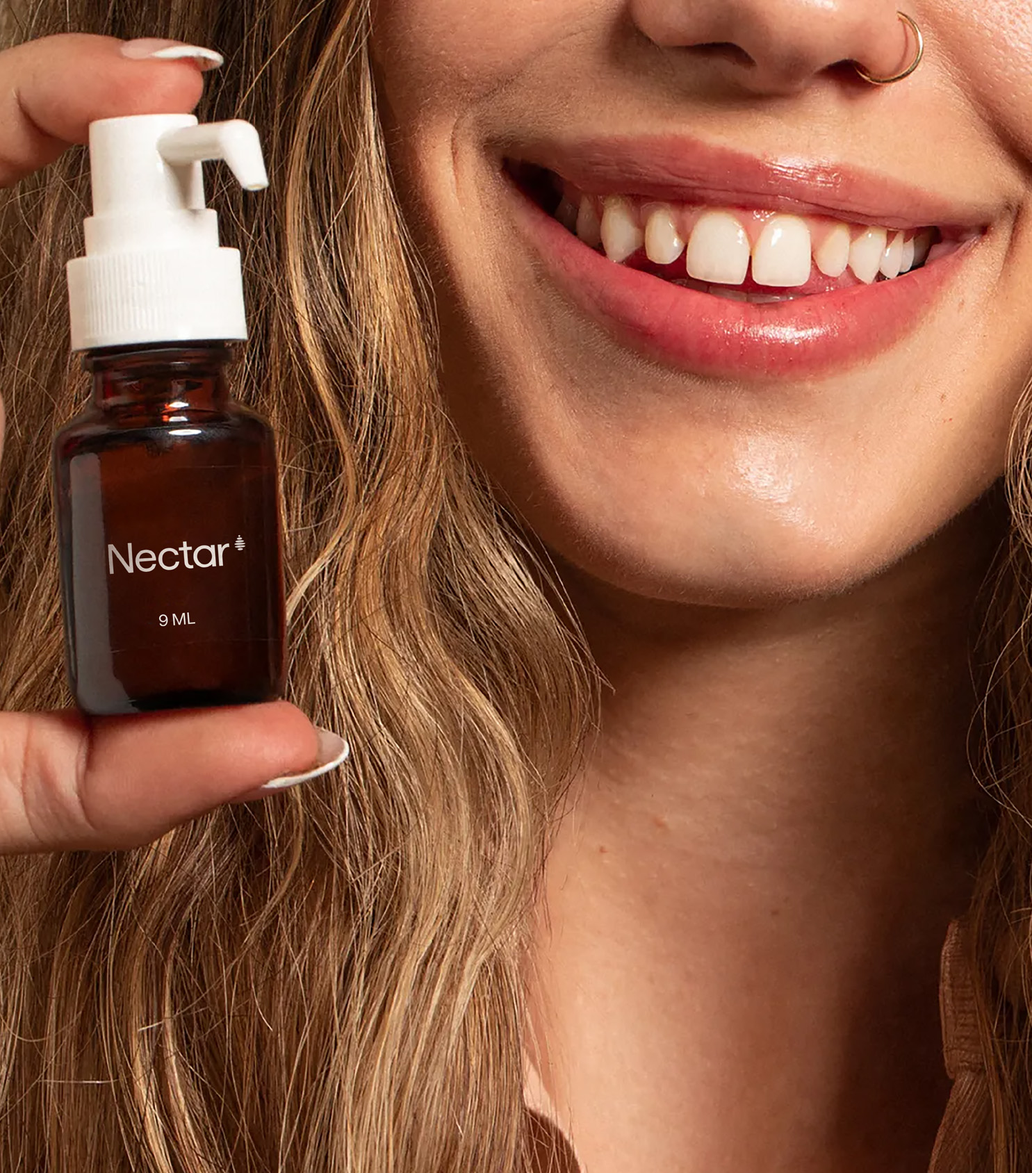
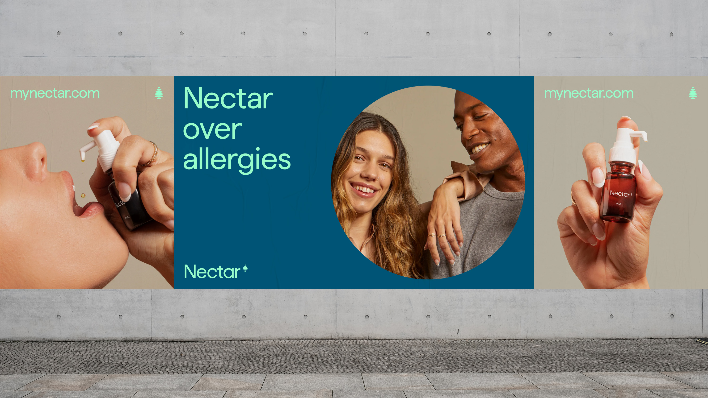
Nectar is an at-home allergy treatment and testing provider dedicated to putting an end to allergies. Unlike over-the-counter drugs that mask symptoms, their allergy drops treat the root cause through immunotherapy.
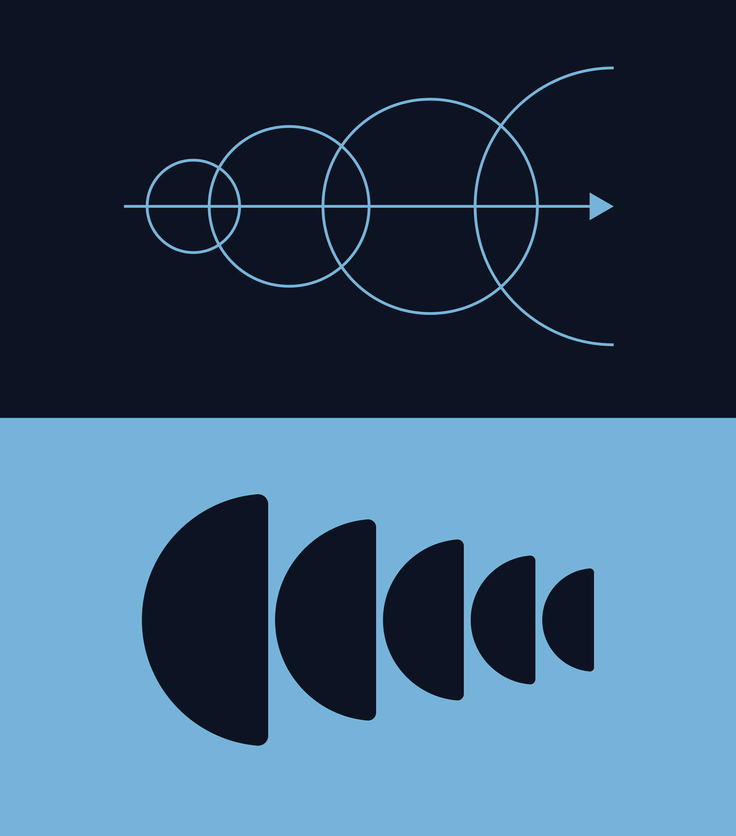
For the design, we leveraged the notion that big change can start with something simple. Like a droplet making ripples in water, an activity as easy as using allergy drops can change our lives forever. The identity celebrates simplicity and structure—with a fluid edge—to show that something doesn’t have to be tedious or complicated to make a big change.
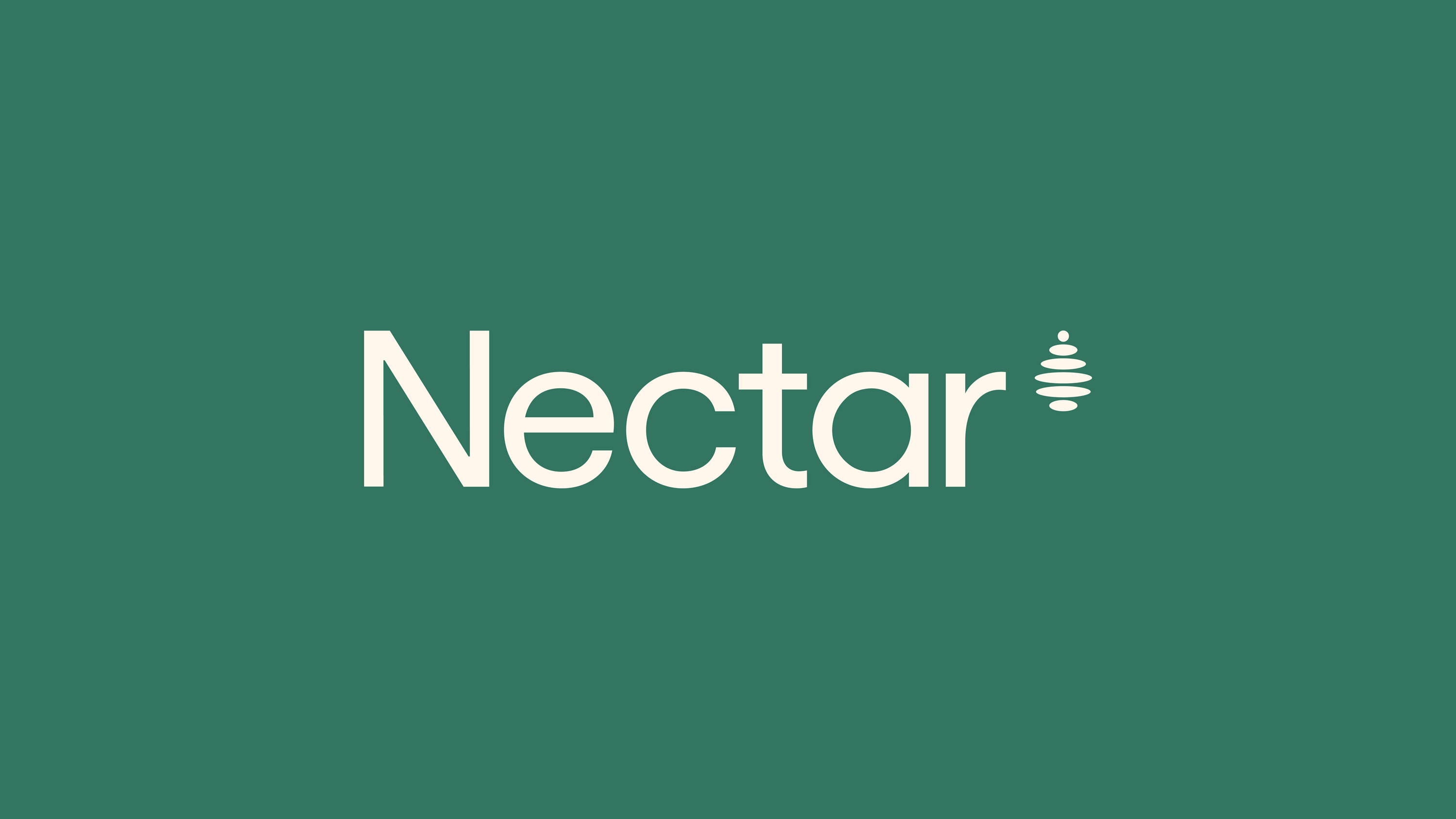

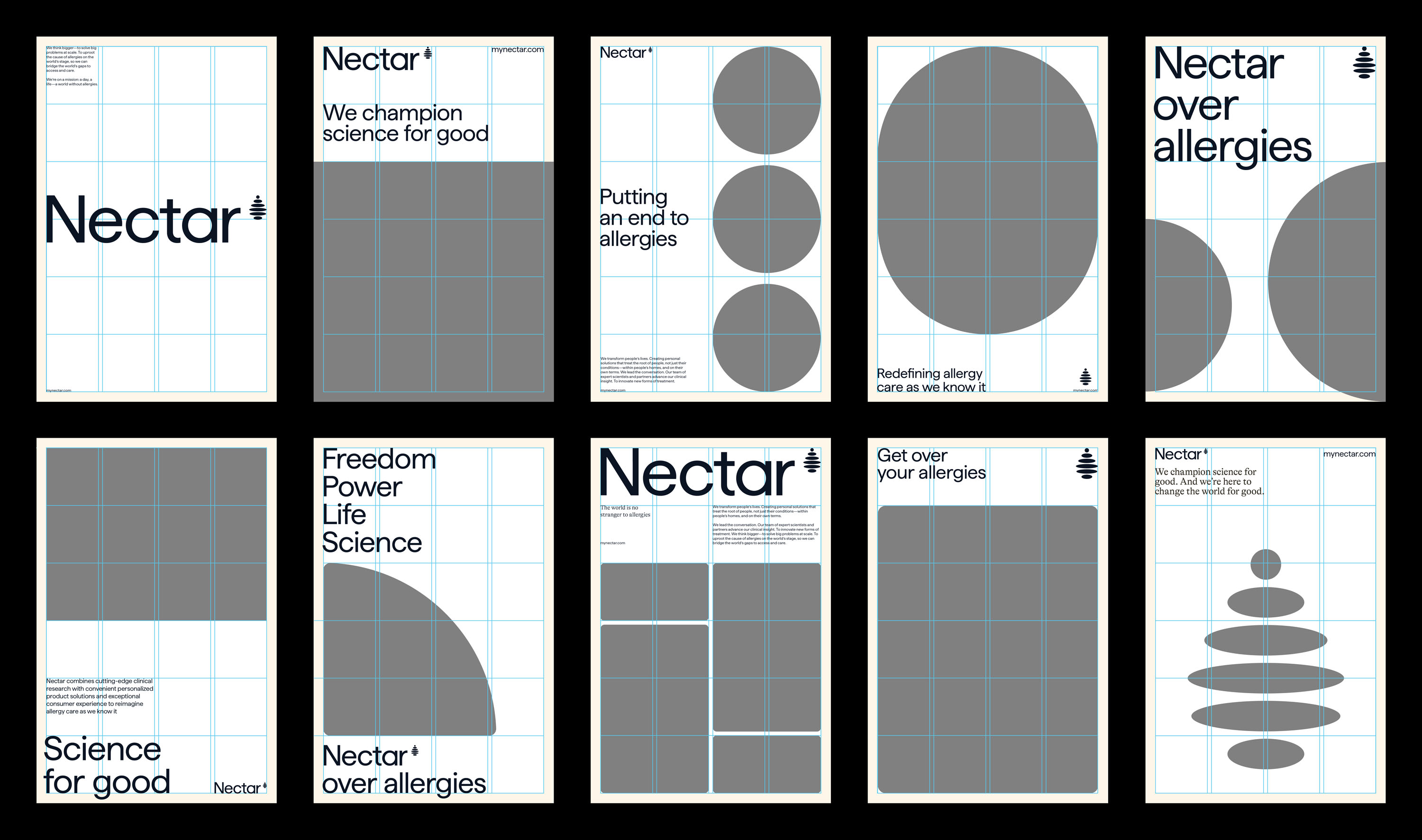
The logotype incorporates the structure and simplicity found within our overall system—maintaining a credible, approachable tone. Our mark sits anchored to the top of the logotype, representative of the potential for change.
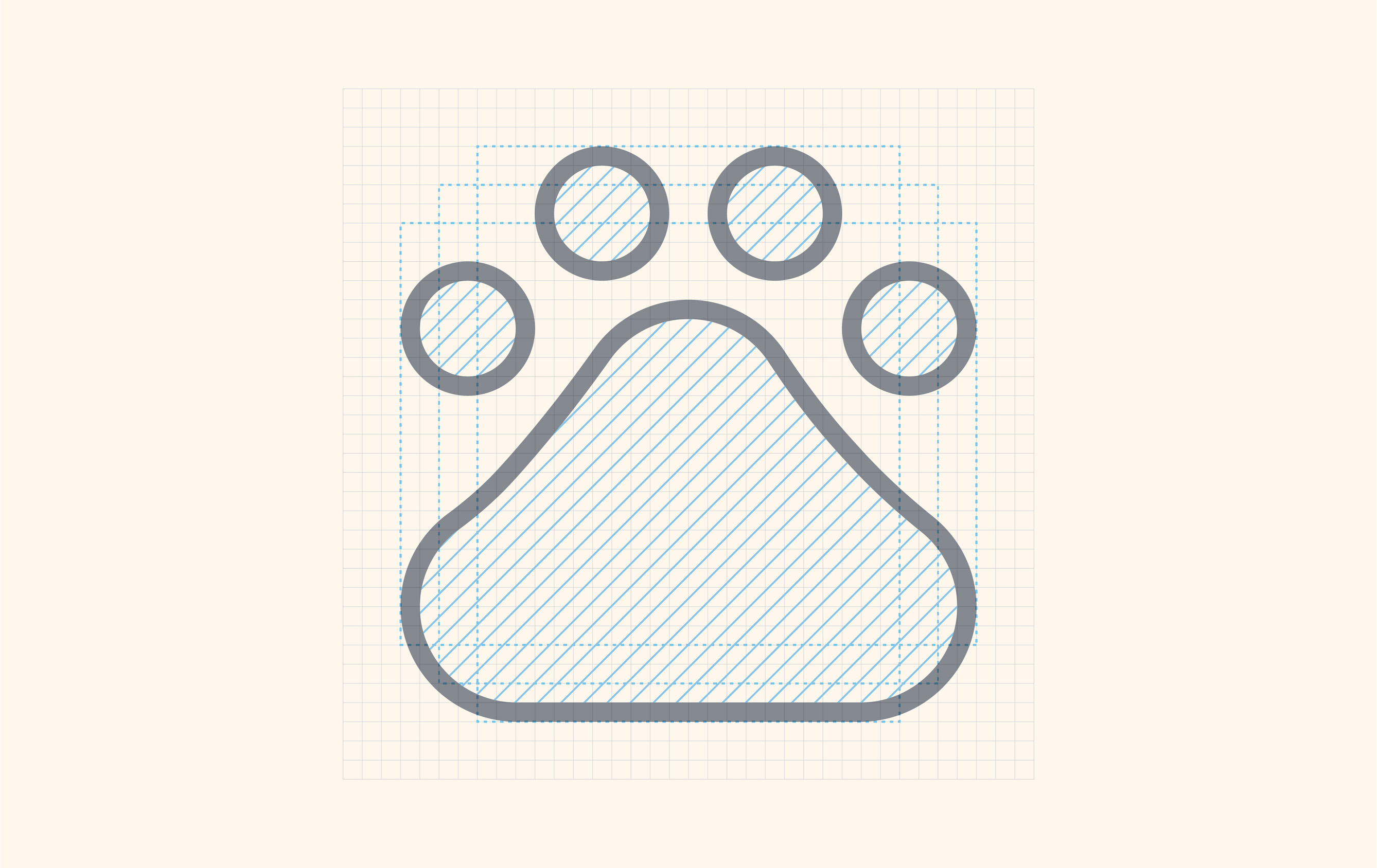
The structure of our mark references a single droplet making a ripple effect. The forms build off of one another to make the silhouette of a droplet, creating a direct correlation to the brand name and the narrative of fluidity. It incorporates six forms, mirroring the amount of letters within the brand name and the six elements found in nature.
The structure of our mark references a single droplet making a ripple effect. The forms build off of one another to make the silhouette of a droplet, creating a direct correlation to the brand name and the narrative of fluidity. It incorporates six forms, mirroring the amount of letters within the brand name and the six elements found in nature.


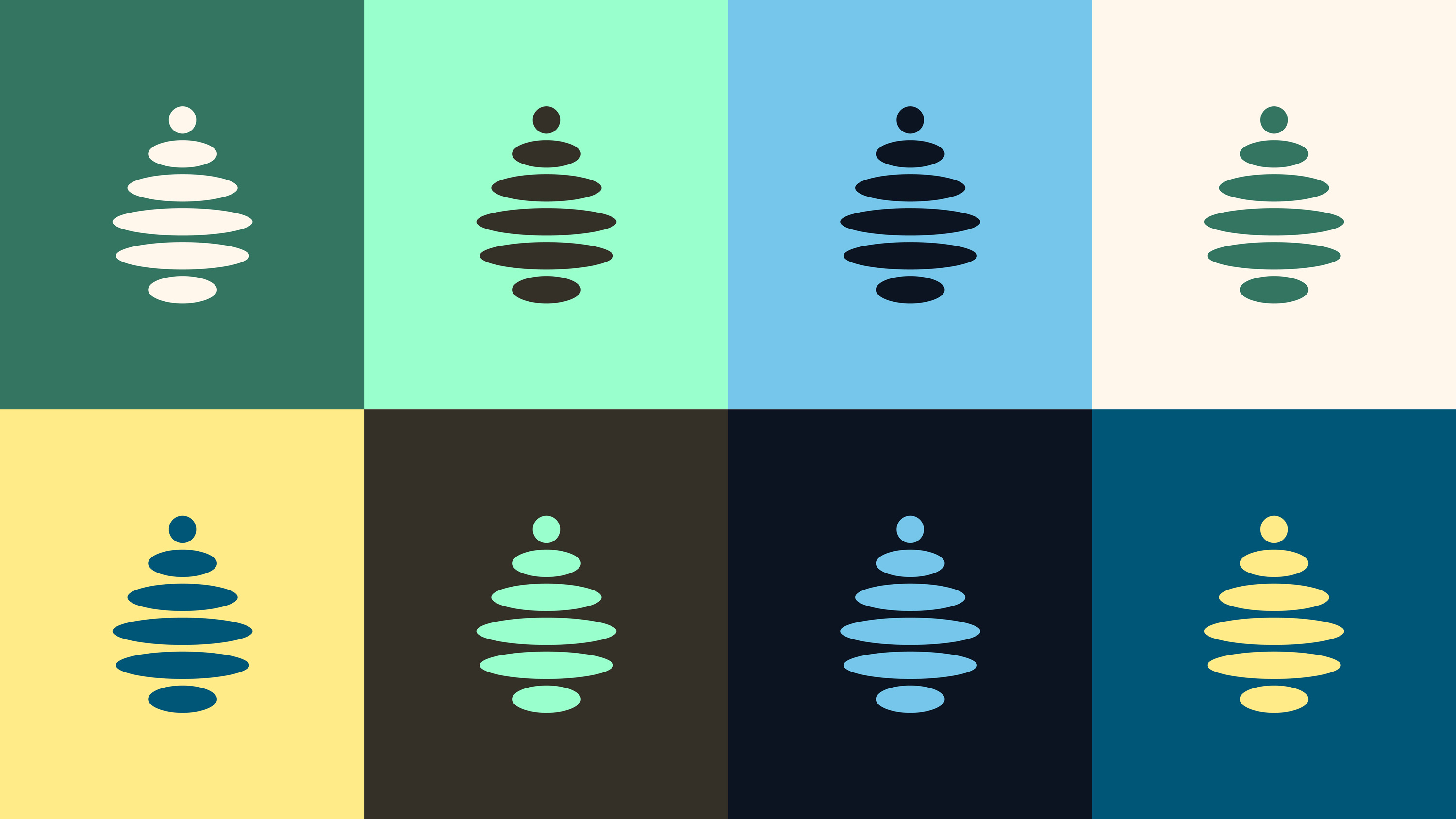
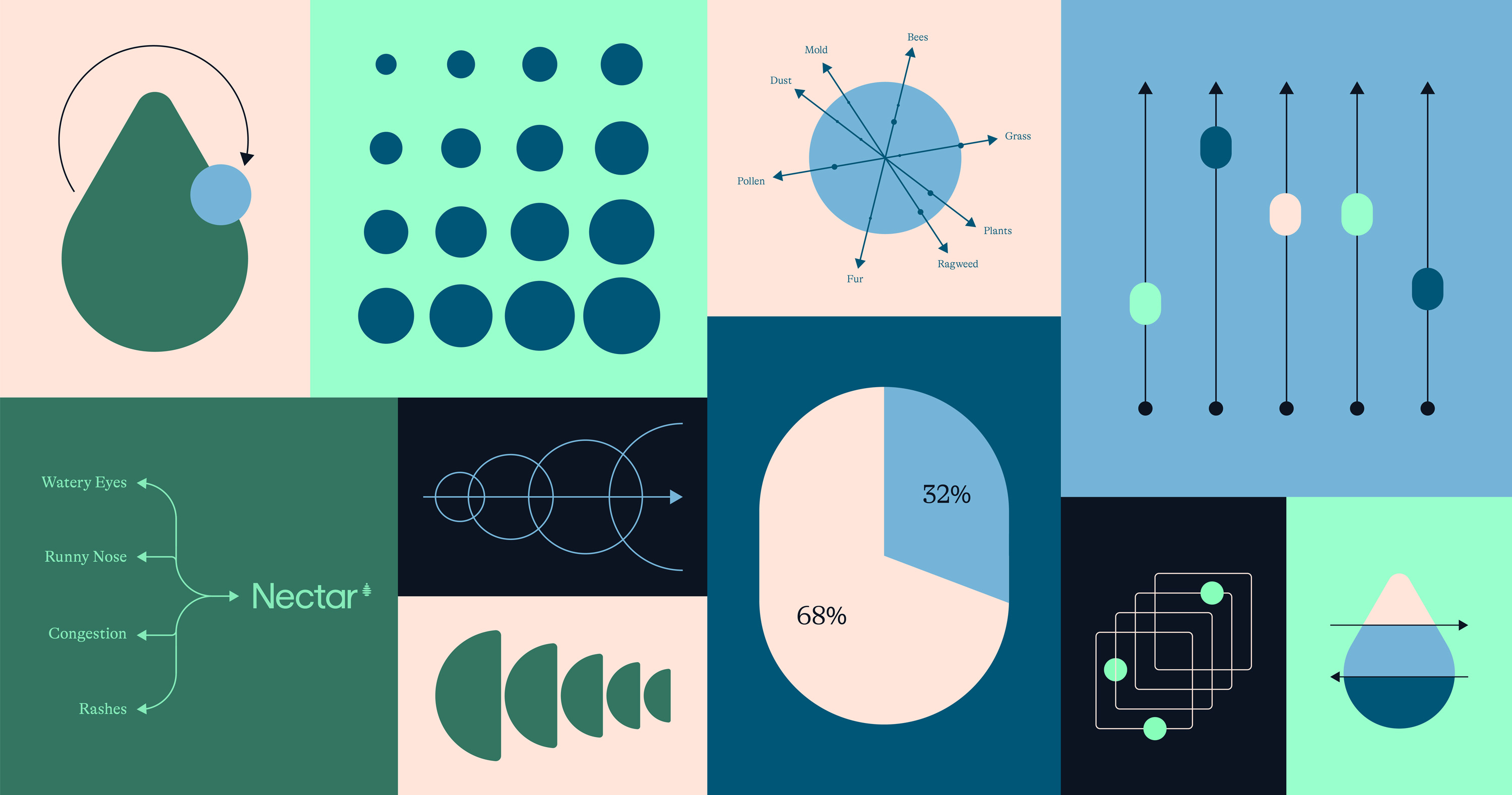
Drawing inspiration from nature, our brand palette was developed to express all the different sentiments Nectar aims to portray.
Green is the hero color because of its overall positive connotations to growth, rebirth, and relationship to nature.
The secondary palette extends our primary shades and offers a number of variations for creative and functional purposes.
Green is the hero color because of its overall positive connotations to growth, rebirth, and relationship to nature.
The secondary palette extends our primary shades and offers a number of variations for creative and functional purposes.
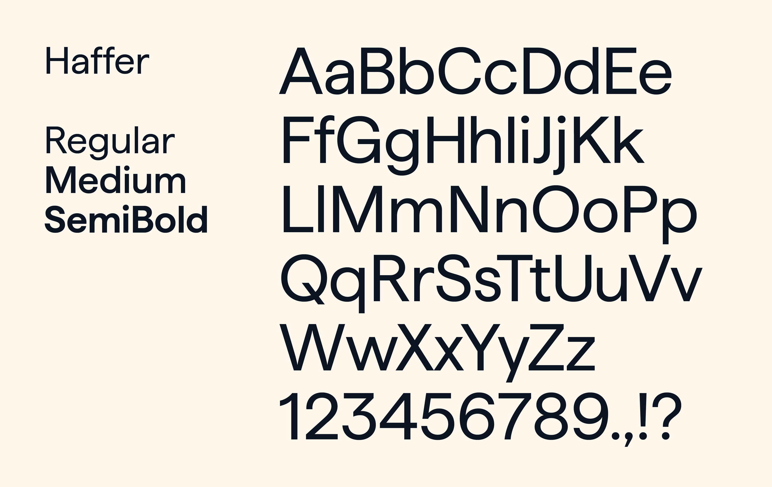
Haffer was chosen as the primary typeface, due to its balance of structure, simplicity, and approachability. This helped create the scientific tone for the Nectar brand, while the rounded edges of the letterforms draw a subtle reference to our concept of fluidity.
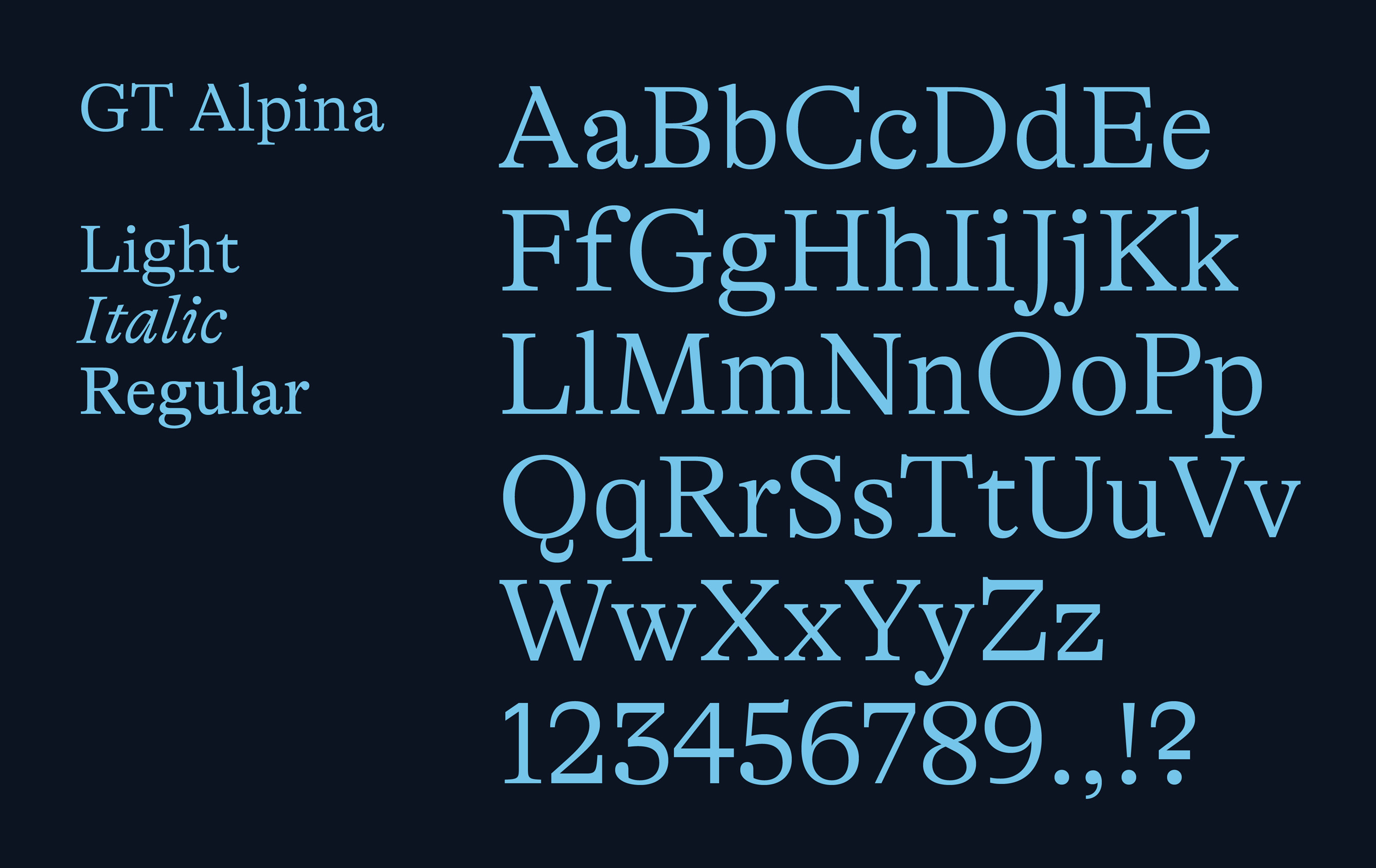
GT Alpina serves as the secondary typeface and also supports our droplet language with its ball terminals. This workhorse serif utilizes strong historical typographic shapes, meant to be both expressive yet pragmatic.

The system incorporates elements of both the circle and the square with our fluid building blocks—helping to balance the elements of structure and fluidity.